Some projects are password protected. Please contact me to learn more!
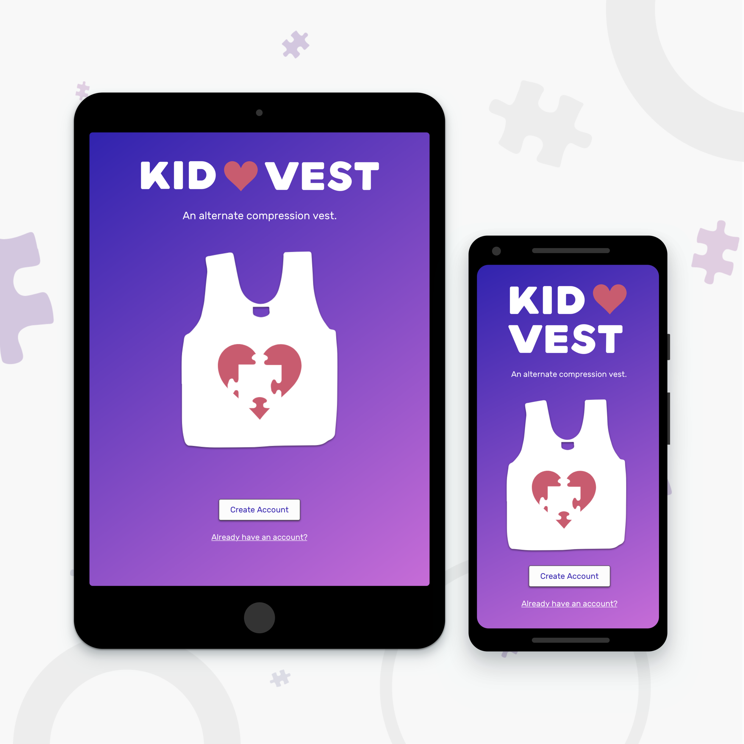
Kidvest aims to provide an alternative to weighted vests, which are used by children diagnosed with Autism. By creating an alternative compression vest, he/she can experience an improved methodology with coping with anxiety, as well as improved behavior.
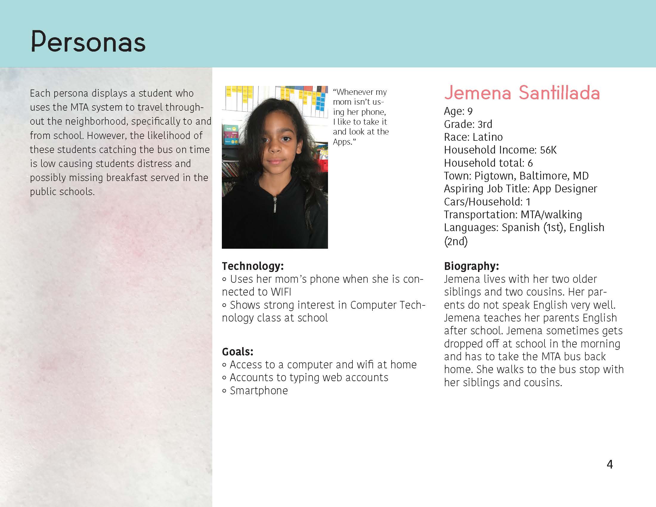
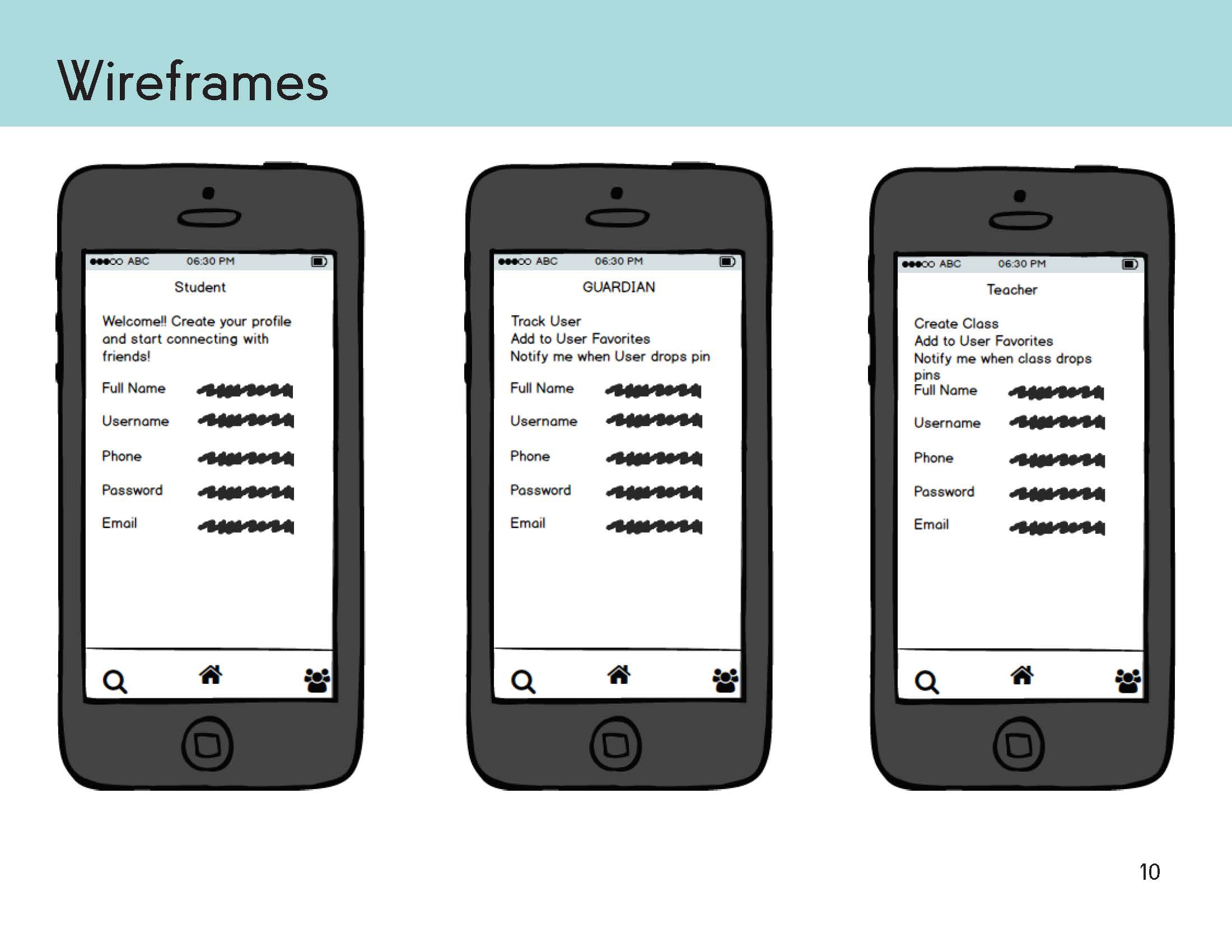
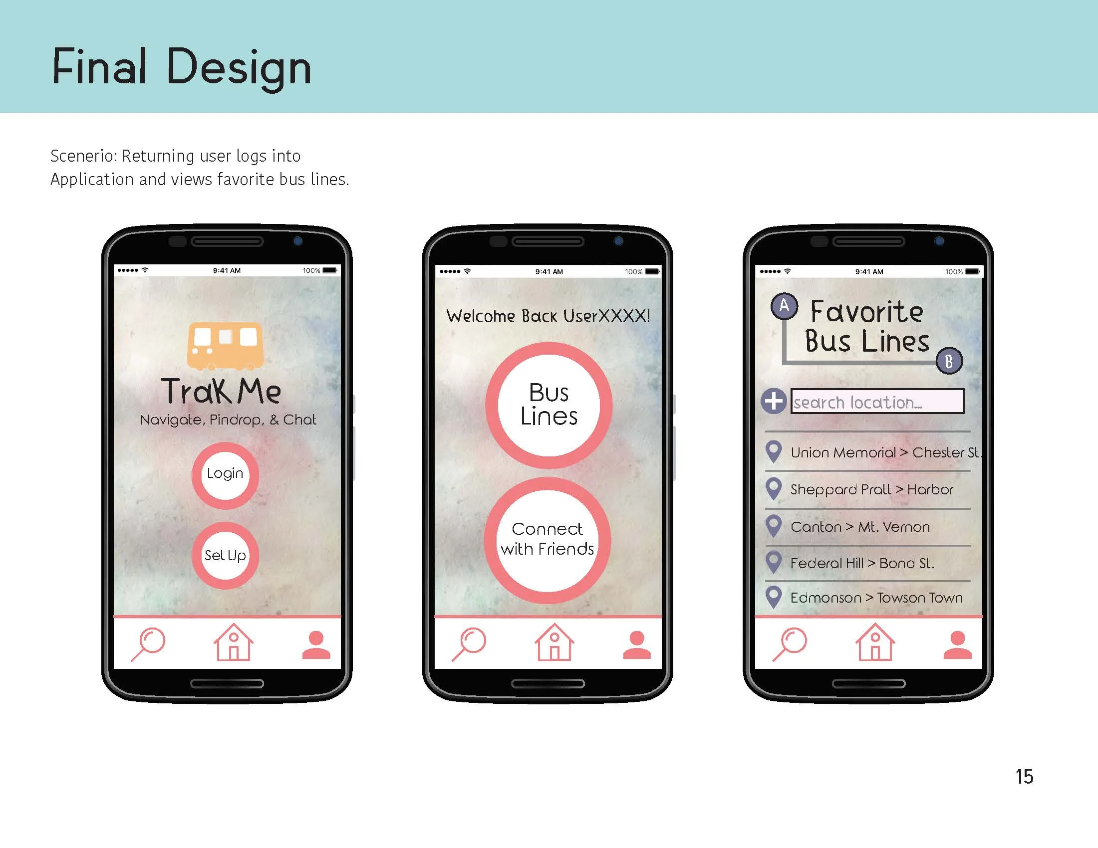
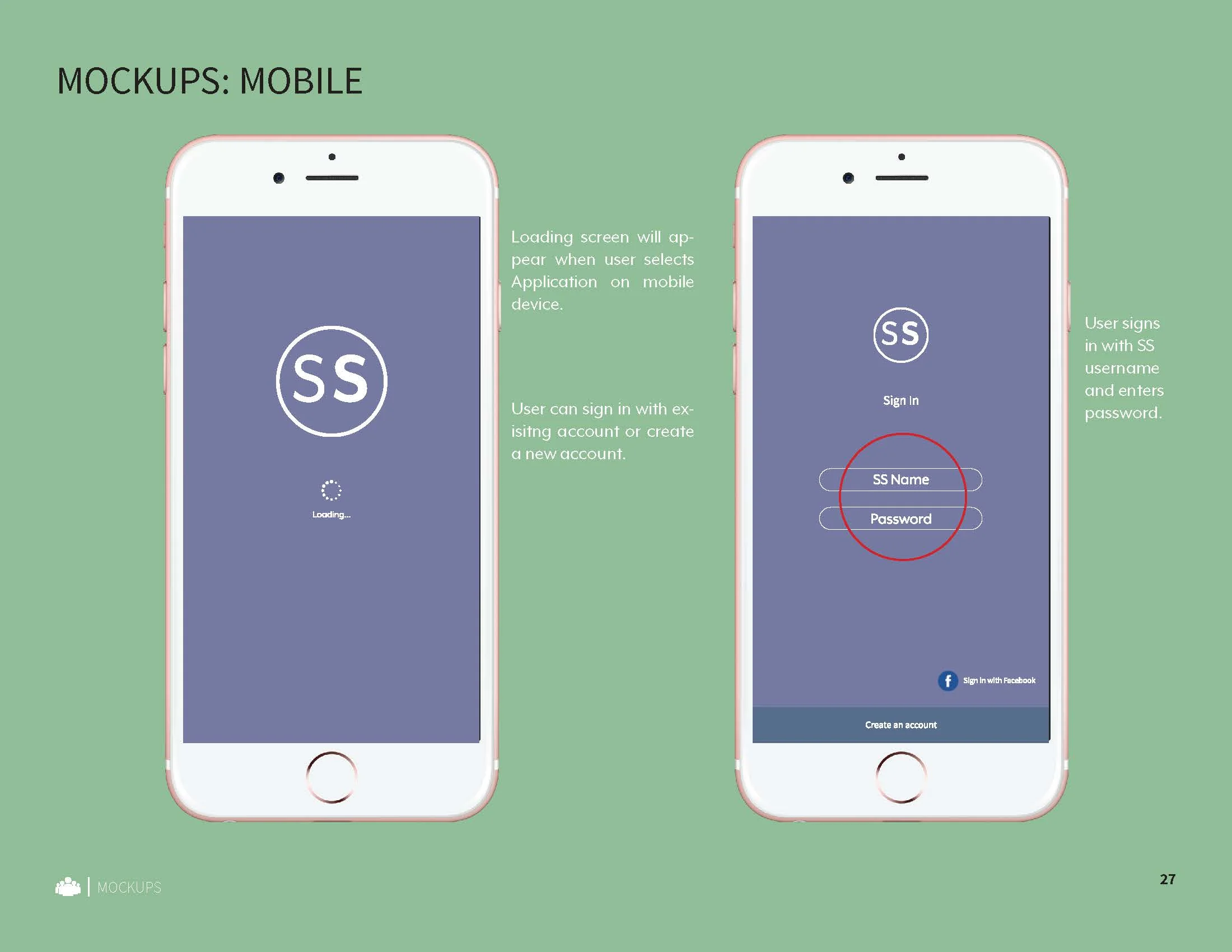
TrackMe is a MTA Bus Application designed for children, ages 8-12 who live in low-income areas in Baltimore City. This App is designed to assist those who lack the access to digital technology on a regular basis and have low reading levels. Many children without access to daily use of digital tools begin to show low digital literacy skills that include slowness in typing, lack of intuitive drag & drop capabilities, and delayed knowledge of selecting buttons. Therefore, the focus of TrackMe is to eliminate human errors by creating a functional and user-friendly device.
High Fidelity prototype | Sketch
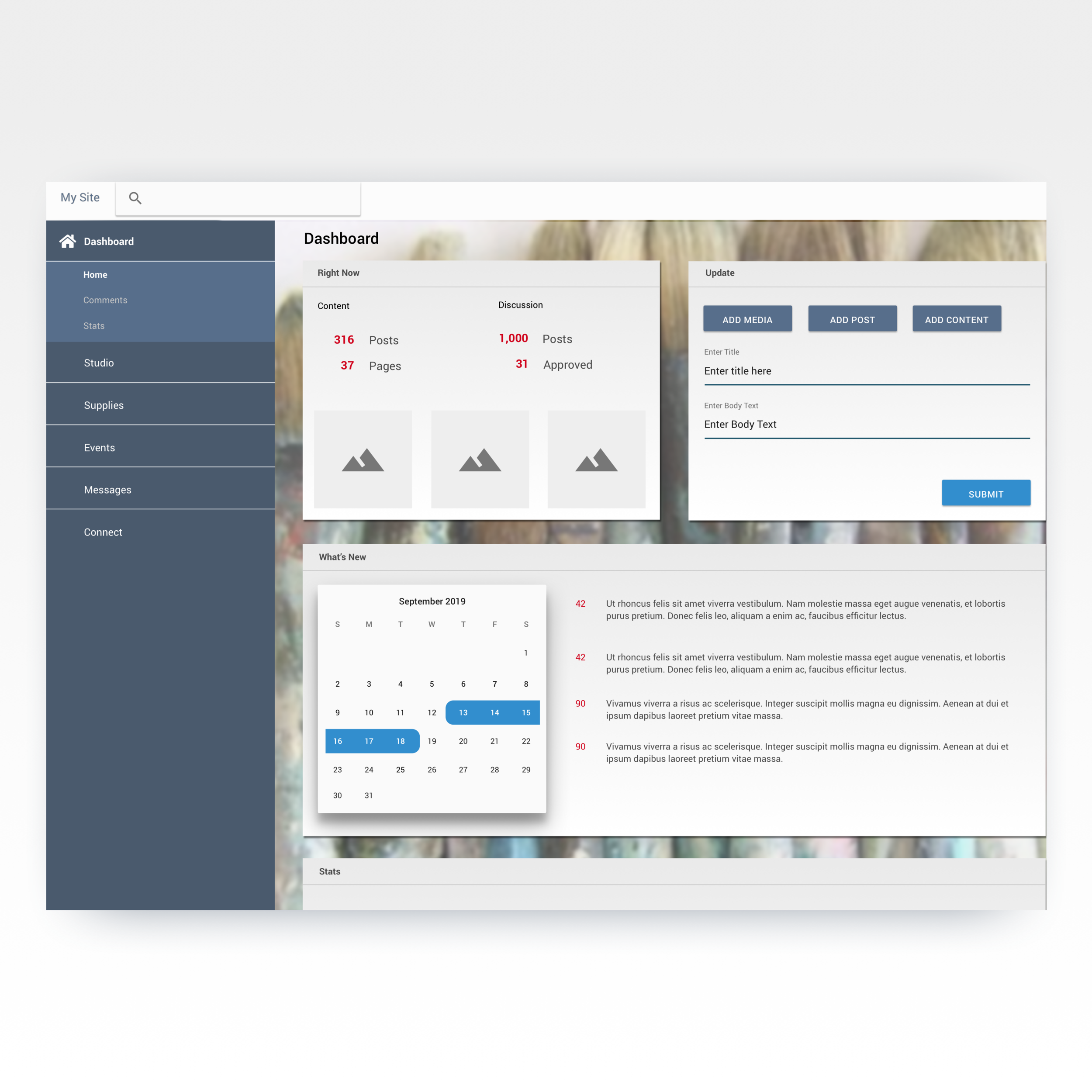
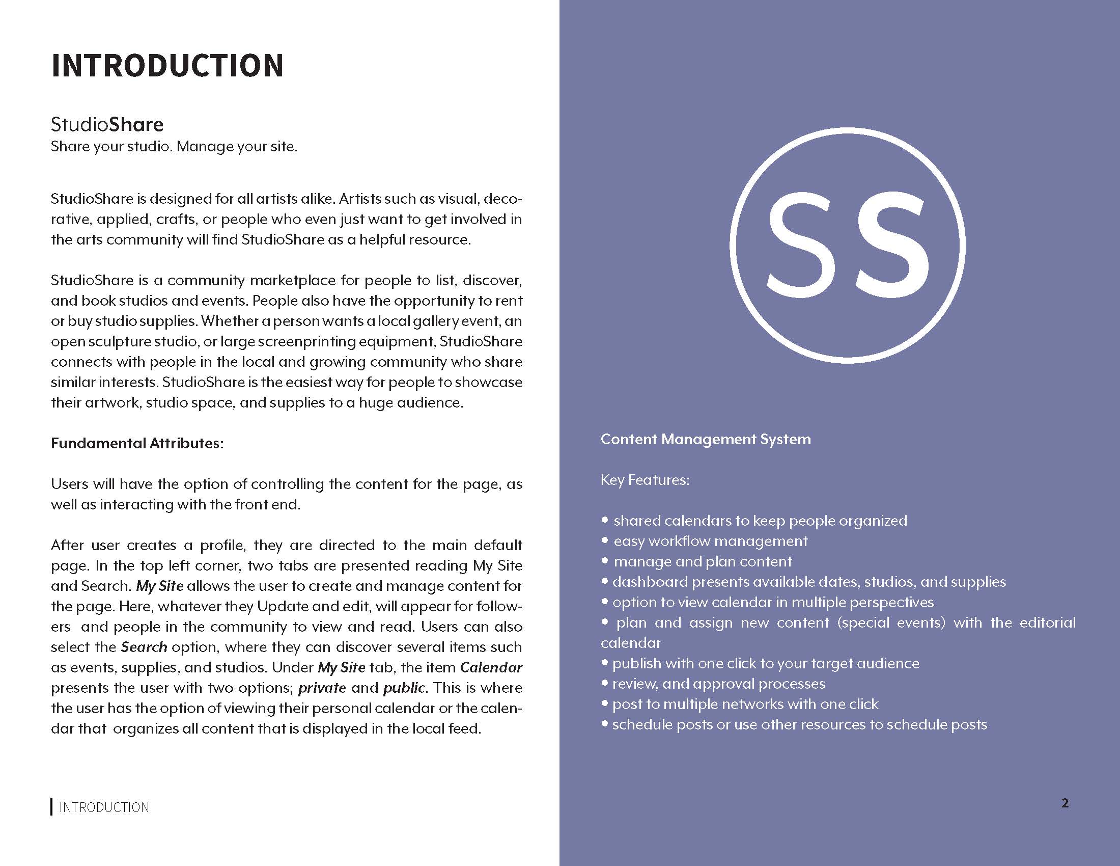
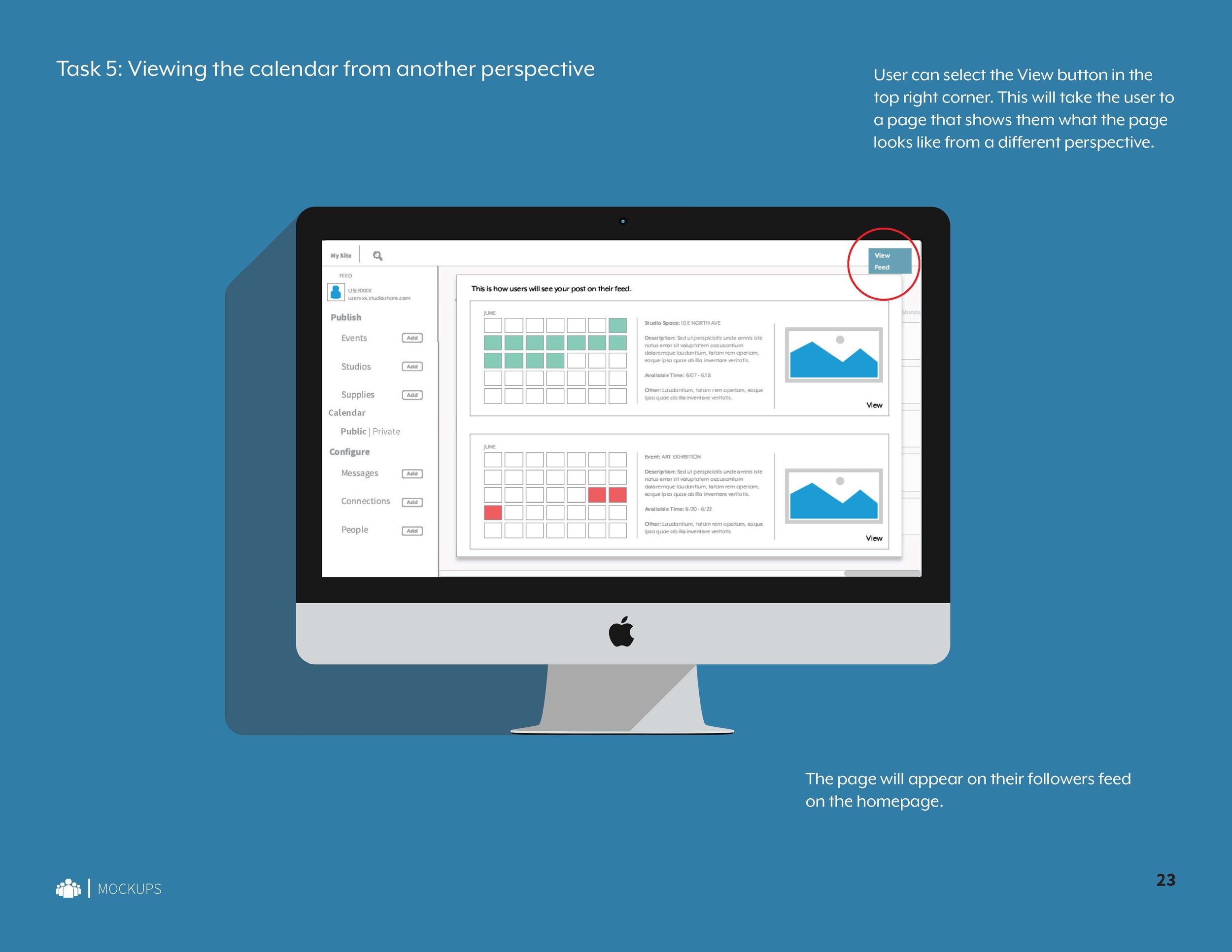
StudioShare is designed for all artists alike. StudioShare is a community marketplace for people to list, discover, and book studio supplies. People have the opportunity to rent and/or buy studio supplies.
High fidelity mockup based on materials design
THE PROJECT
Center Stage, a local theatre located in midtown, Baltimore, MD asked the students of University of Baltimore to design an unique and interactive experience for visitors. The purpose of the interaction is to increase the number of visitors, as well as attract a larger and more diverse target audience. As a group, Rhiannon Fox, Kate Coates, and Suzanne Royer, and myself included worked collaboratively in a team to brainstorm, draft, and execute a user experience that would imbue “access for all”, prime the audience for the Center Stage production, as well as deepen the storytelling, all in a space that crosses the digital and physical world.
COMPETITIVE ANALYSIS
Each of us played a significant role in the lifecycle of the project. My duties included brainstorming the initial idea, writing the personas, conducting a competitive analysis and selecting an existing inspiration to write about, taking original photographs around Baltimore City of inspirations (gathered from Light City Festival), drawing original sketches of design space, creating a storyboard, as well as gathering information through physical user testing. Mainly, I am most proud of my input in the beginning of the project lifecycle, in which my original ideas were formed and expressed to the group. I was able to observe the idea blossom into the final interaction.
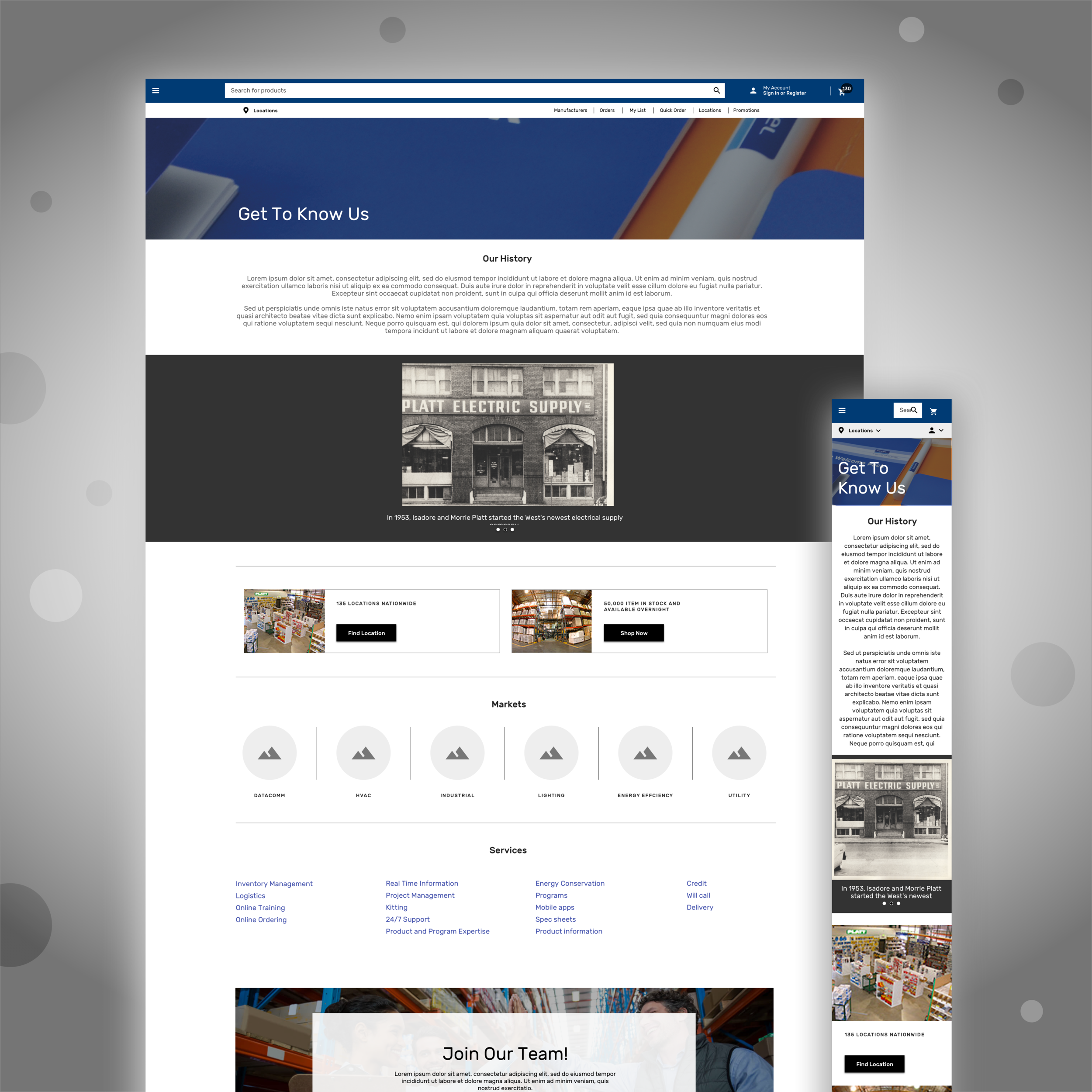
This is the complete style guide that I worked on for GrantSolutions. The style guide includes all the necessary components that are used to build the GrantSolutions modules. The goal of GS is to move away from separate modules and to move towards creating a seamless interface. Here, the style guide displays components that developers can use as a reference when creating new modules, as well as updating current interfaces.
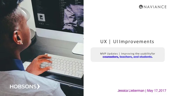
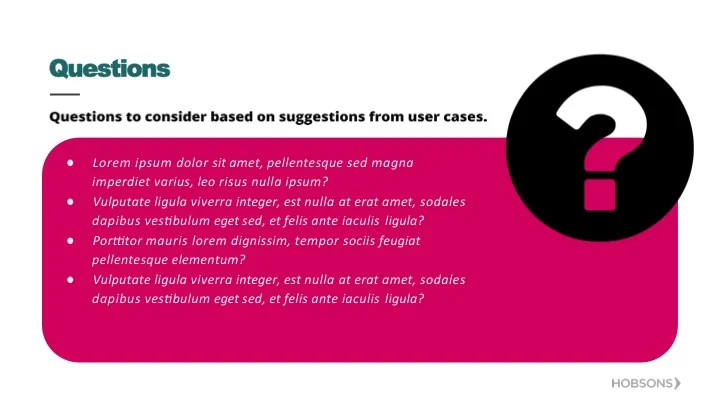
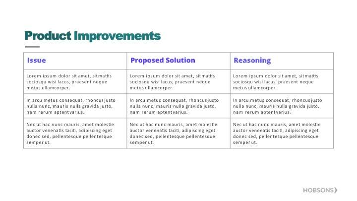
I worked on the Naviance team, which is a K-12 college and career readiness solution platform at Hobsons.
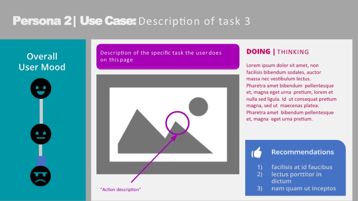
This project is a deliverable template that models the UX design pipeline that is followed when completing a full analysis, whether it’s a single page on the platform or a big slice of the product’s interaction. While completing an analysis, the UX best practices are strategically picked based on specific goals. The type of research is selected from a list of practices including user journeys, contextual interviews, and competitive analysis.
THE PROJECT
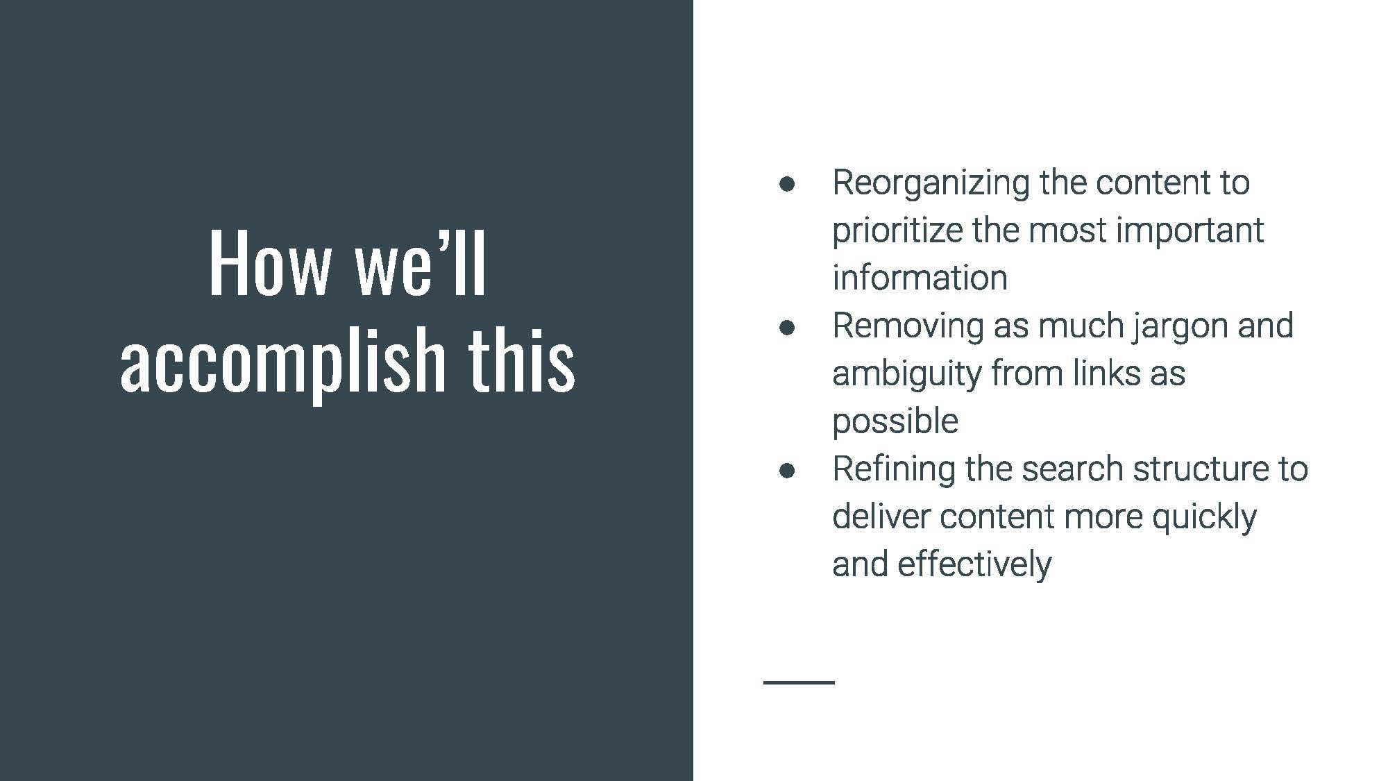
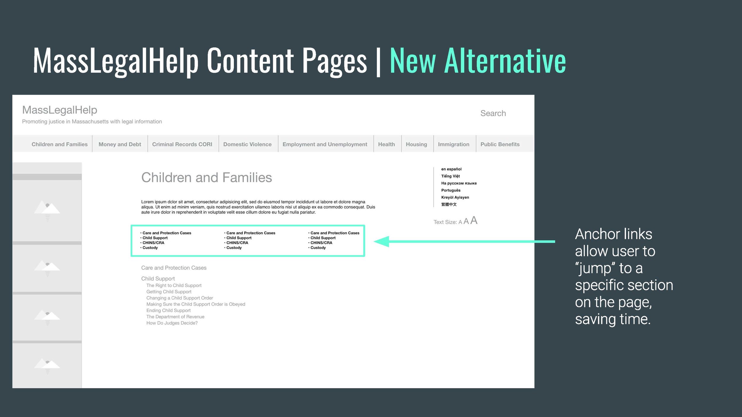
This project analyzes the information architecture of the current MassLegalHelp.org, which is a site aimed to provide Massachusetts citizens with legal information.
CONTENT INVENTORY / CARDSORTING
Some of my roles included collaboratively creating a content inventory, writing personas and scenarios, cardsorting with representative users to test new IA, develop user journeys and task flows, and collaborate with the final presentation of strategy. I also made sure the deliverable was concise and the slides were focused on attention to detail in a user-friendly way. Additionally, I made sure the colors, typography, and visual look and feel reflected design best practices and consistency.
This project focused on using modern research methods to analyze and gather information in order to improve the usability of the MICA library website.
Tasks:
- Seek target audience for research
- Create personas
- Write user testing script
- Schedule appointments with users
- User testing using Tobii eye tracking software
- Analysis of data – completion of user matrix
- Propose recommendations
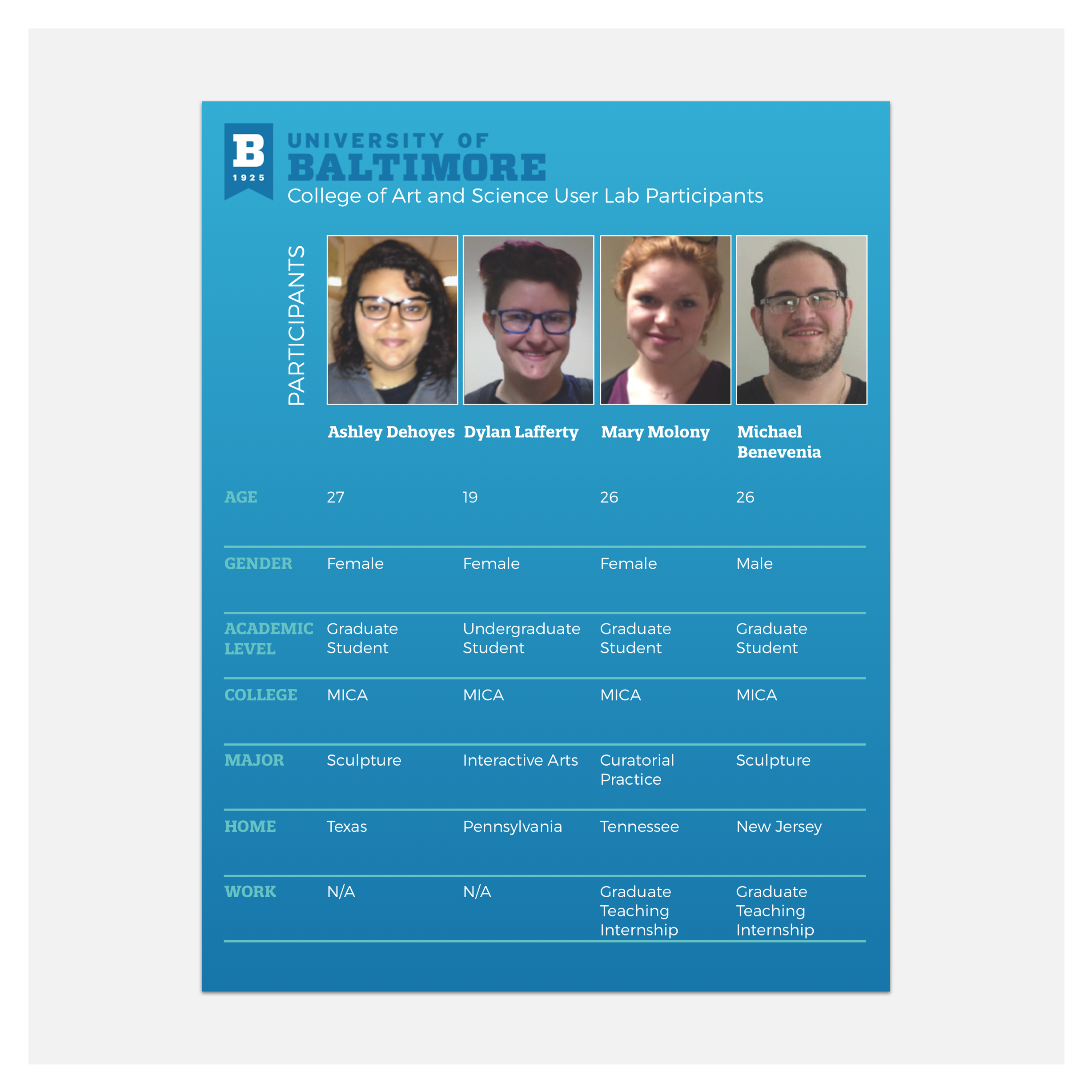
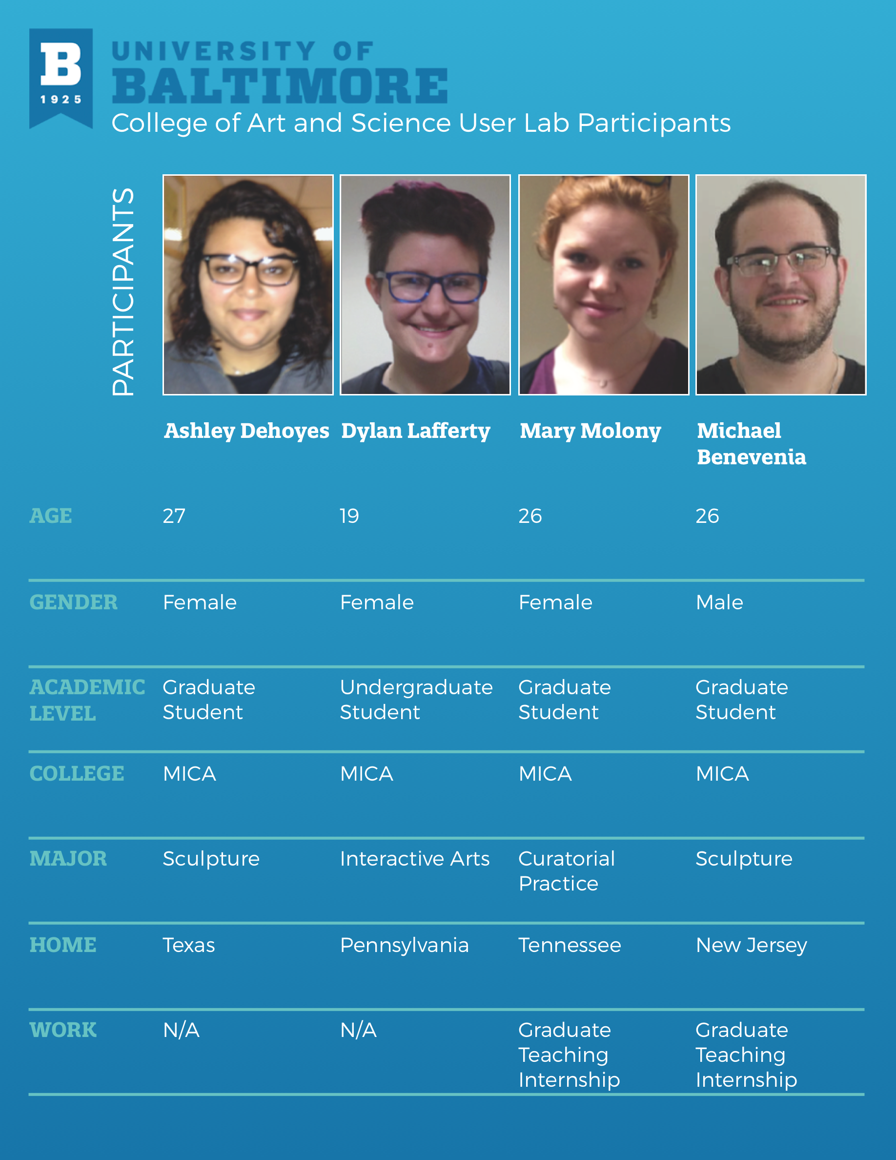
This is a representation of all of the participants that volunteered to be part of the MICA library website redesign project. All four personas are represented in one matrix that shows the age, gender, academic level, college, major, their hometown, and place of work.
The script was used to conduct user testing. The facilitator read the scenarios to the participants, as they completed the tasks, while the notetakers recorded the observations.